Let’s be completely real: we form opinions about everything we look at in less than a second. Before we even read a single sentence on a website, a social media flyer, or a product package, our brains have already decided how we feel about it. That is the quiet, undeniable magic of graphic design. It isn’t just about making things look pretty or scattering random decorations across a blank canvas; it is a highly intentional form of visual communication. Good design takes complex, messy human ideas and translates them into crisp, beautiful images that can change minds, spark emotions, and build instant trust.
We are currently living in a world that is completely flooded with visual information. Every single day, your eyes scan thousands of logos, advertisements, and digital posts, all fighting desperately for a piece of your limited attention. In this crowded digital landscape, basic, sloppy layouts simply get filtered out and forgotten. Learning how to create professional visuals is no longer a niche skill reserved only for eccentric artists in expensive studios. It is a powerful, essential language that anyone can learn to speak to share their stories, launch their businesses, and connect with people on a deeply human level.
Finding the Perfect Creative Digital Canvas
Every great maker needs a workspace that matches their hands, and the world of visual design is no different. The massive explosion of modern technology has completely broken down the old barriers to entry. Today, you don’t need a formal arts degree or a supercomputer to start building stunning visuals. The secret is simply choosing a digital software that respects your current skill level while giving you room to stretch your wings and grow.
   [The Easy Entryway] ──► Drag-and-drop templates, pre-made font pairings, fast creation
   [The Expert Sandbox] ──► Custom vector shapes, pixel-level detailing, complex layouts
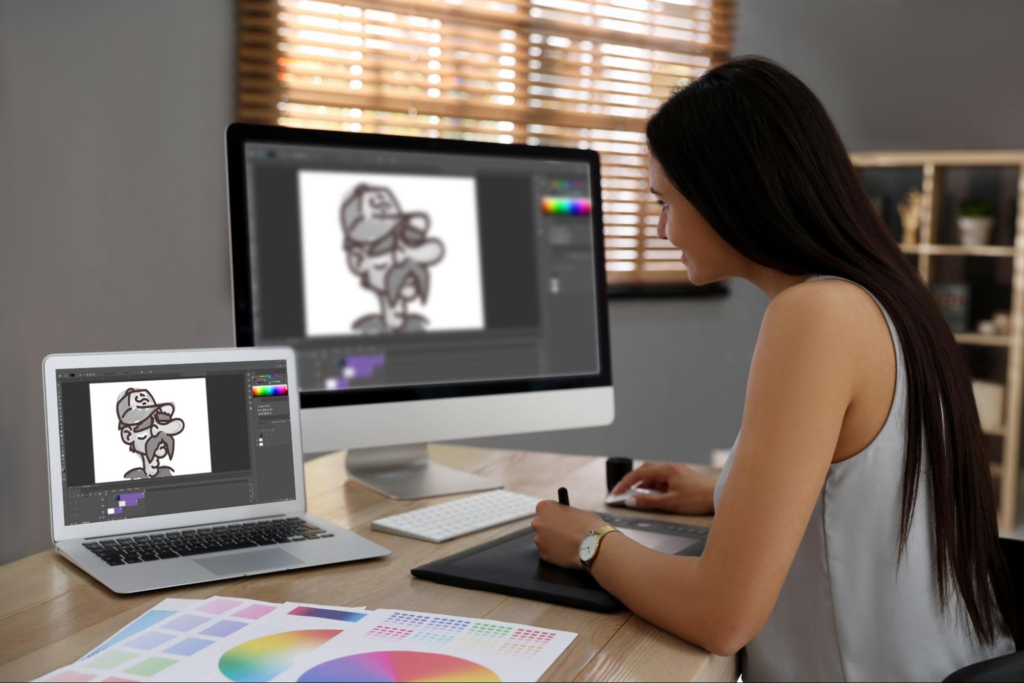
If you are just dipping your toes into the design water, user-friendly, browser-based applications like Canva or Figma are absolute game-changers. They give you instant access to clean layouts and simple interfaces that let you bring your ideas to life in minutes. On the other hand, if you want absolute, microscopic control over every single pixel and line, standard industrial powerhouses like Adobe Photoshop and Illustrator offer a bottomless sandbox of advanced tools. The best tool isn’t the most expensive one; it is the one that allows your creative ideas to flow from your mind to the screen with the least amount of friction.
The Silent Rules That Hold a Picture Together
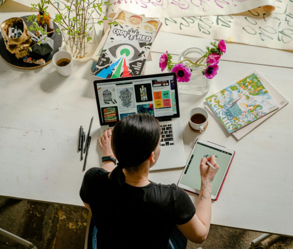
There is an invisible skeletal structure behind every piece of design that feels good to look at. Have you ever stared at a poster and felt instantly confused or overwhelmed, even if you couldn’t quite explain why? That happens because the creator broke the fundamental laws of composition. Professional design relies on a handful of timeless, intuitive rules that align beautifully with how the human brain naturally processes the physical world.
                 PAST                                            FUTURE
       ┌──────────────────────┐                        ┌──────────────────────┐
       │ Shoving text into    │   (Moving toward a)    │ Using generous space │
       │ every empty corner   │───( clean, intentional)──►│ to let the primary   │
       │ creating total chaos │   │    visual route  │   │ message breathe deep │
       └──────────────────────┘                        └──────────────────────┘
The first major pillar is visual hierarchy—the art of telling the viewer’s eyes exactly where to look first, second, and last. You achieve this naturally by playing with scale, putting your biggest message in bold, heavy lettering while letting supporting details sit in smaller, quieter text. Alongside hierarchy sits the magic of negative space, often called white space. Amateur creators often panic when they see empty room on a page and try to fill it up with unnecessary clutter. But professional designers treat empty space like oxygen; it gives your design room to breathe, casting a brilliant spotlight on the things that actually matter.
The Emotional Spectrum of Fonts and Hues
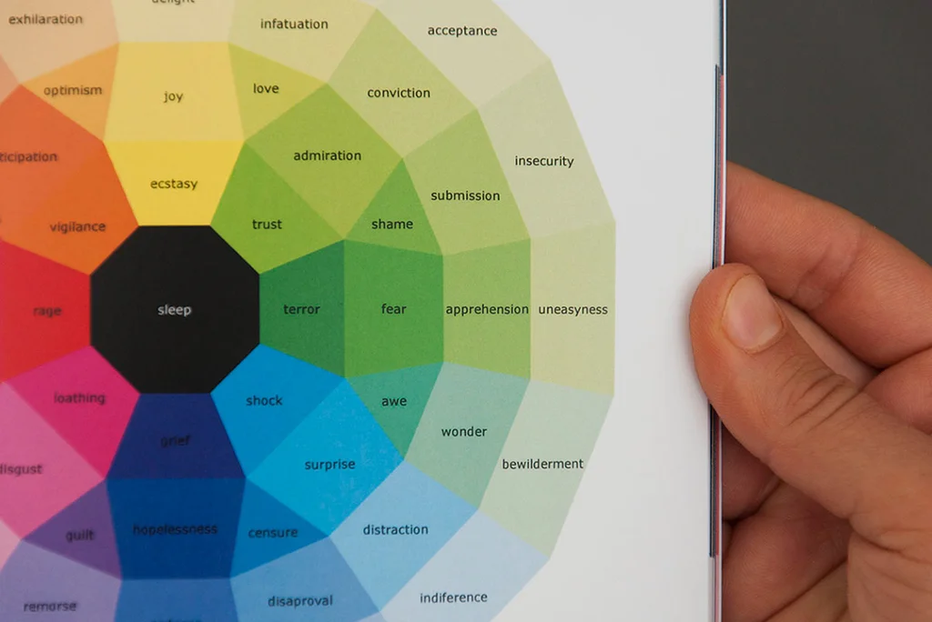
Colors and typefaces are the true emotional powerhouse of visual communication. They carry an intense, subconscious weight that dictates the tone of your message before a word is actually understood. Think of a color palette like the soundtrack of a movie. Vivid, electric neons shout with youthful energy and playful rebellion, while soft, muted earth tones wrap the viewer in a sense of calm, premium organic luxury, and timeless stability.
- The Subconscious Mood of Color: Developing a beautiful color scheme isn’t about guesswork; it is about human psychology. A finance application uses deep blues to quietly whisper security and stability, while a food brand might embrace rich reds and warm yellows to stimulate appetite and evoke excitement.
- The Personality of Typography: Typefaces have distinct voices. Clean, modern sans-serif fonts look sleek, forward-thinking, and tech-savvy. Old-school serif fonts—the ones with the elegant little feet on the ends of the letters—feel traditional, authoritative, and deeply literary.
- The Art of Readability: No matter how beautiful a font looks, it fails completely if your audience has to squint to read it. Professional styling requires a careful balance of letter-spacing, line-height, and high contrast against the background to keep the reading experience completely effortless.
When you learn to pair a strong, character-filled headline font with a clean, highly readable body typeface, your layouts instantly transform. You establish a beautiful visual rhythm that guides the reader through your content like a friendly tour guide, ensuring your core message is absorbed with absolute ease.
The Unforgiving Law of High-Resolution Imagery

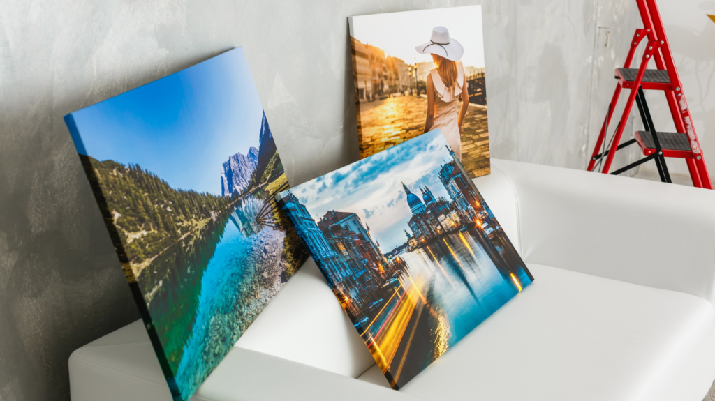
Let’s be completely honest: you can get every single design principle right, pick the most breathtaking colors, and write the most brilliant copy, but if you drop a grainy, pixelated, or stretched-out image into the center of your layout, the entire project instantly loses its credibility. The human eye is incredibly sensitive to visual quality. Using crisp, high-resolution graphics, custom illustrations, or premium photography is a non-negotiable requirement for building visual authority.
   [Low-Quality Trap] ──► Pixelated edges, generic stock clichés, messy backgrounds
   [Professional Standard] ──► Razor-sharp clarity, authentic emotion, clean compositions
Furthermore, professional design requires an eye for careful cropping and placement. It is about understanding how an image interacts with the text around it. A great designer knows how to use the natural lines within a photograph—like the direction a person is looking or the line of a road—to point directly toward the headline. By treating your images as active, structural components rather than lazy decorations, you create a seamless, integrated final product where every element works together as a unified team.
Breaking Out of the Template Cage
There is absolutely no shame in using pre-made design templates, especially when you are just starting out or working against a brutal deadline. Templates are fantastic learning tools; they are like training wheels that show you how professional layouts handle spacing, font sizes, and structural balance. They provide an incredible spark of inspiration when you are staring blankly at a terrifying, empty white screen.
[Raw Template] ──► [Inject Unique Assets] ──► [A Custom, Character-Filled Piece]
But the trap of relying too heavily on templates is that your work can quickly start looking exactly like everyone else’s. To break out of that generic mold, you must learn the art of thoughtful customization. Take a template and tear it apart: replace the generic stock photos with your own authentic images, swap the standard font pairings for your signature typefaces, and realign the layout to fit your specific copy. By using a template merely as a structural launchpad rather than a permanent cage, you save precious time while ensuring your final design possesses an original, distinct soul.
Mastering the Architecture of Digital Elements

As you move past basic layout tools and step into advanced design software, you will encounter the fundamental concept of layer-based editing. Think of layers like stacking sheets of clear glass on top of one another. Each sheet holds a different element—one has your background color, the next holds a photo, another contains a graphic overlay, and the top sheet carries your text. This architecture gives you the incredible freedom to edit, tweak, or completely transform one specific part of your design without messing up anything else.
                     ┌───────────────────────────────────────────────┐
                     │          THE LAYER STACK ARCHITECTURE         │
                     └───────────────────────┬───────────────────────┘
                                             │
    Top Layer ───────────────────────────────┼─── Text, buttons, and call-to-actions
                                             │
    Middle Layer ────────────────────────────┼─── Cropped photos, masks, and illustrations
                                             │
    Base Layer ──────────────────────────────┼─── Background gradients, textures, and solids
                                             │
Once you master layers, you unlock powerful techniques like layer masking—the ability to hide parts of an image smoothly without permanently deleting the file. This lets you pull off advanced creative tricks, like seamlessly cutting a person out of a busy background or blending text behind a physical object in a photo. Learning these core editing mechanics shifts you away from simply rearranging pre-made graphics and turns you into a true digital architect who can shape pixels to match any wild idea inside your head.
Building a Visual North Star for Your Brand

Whether you are an independent content creator, a small local shop owner, or a massive global business, your survival depends heavily on brand consistency. If you use bright pink and a playful font on Instagram, but your website features deep navy blue and a rigid, corporate layout, your audience is going to feel confused and disconnected. Inconsistency breeds subtle distrust, making a brand feel disorganized and amateurish.
To build a powerful, recognizable presence, you need to create a visual signature—a dedicated brand style guide. This is a simple, sacred document that outlines your chosen color codes, your specific font families, your logo rules, and the overall mood of your imagery. When you use the exact same visual ingredients across every single touchpoint, you create a cohesive world that your audience can recognize instantly without even reading your name. That repetition builds deep familiarity, transforming a simple digital profile into a trustworthy, professional identity.
Riding the Waves of Ever-Changing Design Trends

Graphic design is a living, breathing cultural mirror. It never stands still. Just like fashion or music, visual styles go through massive cultural shifts driven by technology, social media movements, and changing human tastes. Staying relevant means keeping an active, curious eye on modern aesthetic trends, whether it is the clean, futuristic look of 3D digital elements, the nostalgic comfort of retro grainy textures, or the bold impact of giant, experimental typography.
However, a great designer knows that blindly chasing every single trend that goes viral on the internet is a recipe for disaster. Trends should be treated like seasoning, not the main course. If a hyper-modern, neon punk aesthetic doesn’t match the calm, trustworthy energy of a local organic medical clinic, don’t use it! The truest secret to great design is ensuring that your stylistic choices always serve the core purpose of the project and respect the specific human audience you are trying to reach.
Embracing the Journey of Creative Growth
At the end of the day, becoming great at design isn’t a magical gift that you are either born with or you aren’t. It is a practical, beautiful muscle that grows stronger with every single layout you build, every mistake you make, and every critique you listen to. Don’t be discouraged if your very first designs look a bit clunky or don’t match the magnificent vision inside your head. Every single legendary designer started exactly where you are right now, staring at a blank screen, trying to figure out how to make two fonts sit nicely next to each other.
As you continue on this path, keep your eyes open to the world around you. Analyze the restaurant menus you read, the album covers you love, and the app interfaces you use every day. Ask yourself: “Why does this layout feel good? How did they guide my eyes to that button?” By combining this deep visual curiosity with regular, hands-on practice, you will steadily turn your raw creative energy into a refined, professional skill, giving you the magnificent power to shape how the world sees your ideas.